Good web design is often invisible. When a page simply works — you find what you came for, read it comfortably, and leave satisfied — a series of deliberate decisions made that ease possible. This article walks through the fundamentals that hold true regardless of tools or trends: hierarchy, type, colour, layout, and accessibility.
Start with hierarchy, not decoration
Every page answers a question for the visitor, and design's first job is to make the answer obvious. Visual hierarchy — the order in which the eye lands on things — is created through size, weight, spacing, and contrast long before colour or imagery enter the picture. A useful discipline is to squint at a mockup until detail blurs: whatever still stands out is your hierarchy. If the wrong thing dominates, no amount of polish will fix it.
Typography carries most of the load
Most of the web is text, so type is most of the design. A readable site usually needs only one or two typefaces, a comfortable body size (16px and up), generous line height (around 1.5), and line lengths in the 45–75 character range. Restraint reads as competence. The Nielsen Norman Group has decades of usability research showing that legibility and scannability — clear headings, short paragraphs, meaningful links — matter far more to real users than clever visual flourishes.
Colour with intent
A small, disciplined palette beats a big one. A primary brand colour, a neutral range for text and backgrounds, and one accent for calls to action is enough for most sites. Whatever you choose, verify contrast: body text should meet the WCAG AA ratio of at least 4.5:1 against its background. This is not a niche concern — it is the difference between a site a large fraction of your audience can read and one they cannot. The WCAG quick reference lays out the thresholds.
Responsive by default
More than half of web traffic is mobile, so design begins at the small screen and scales up, not the reverse. A mobile-first approach forces you to prioritise: if content has to earn its place in a narrow column, the resulting page is usually clearer on every device. Modern CSS — flexbox, grid, and container queries — makes fluid layouts straightforward without heavy frameworks. The MDN responsive design guide is an excellent grounding.
Accessibility is design, not an add-on
An accessible site is a well-designed site: semantic headings, meaningful link text, labelled form fields, sufficient contrast, keyboard operability, and images that carry descriptive alt text. These practices help people using screen readers or keyboards, and they also improve SEO and resilience. Treating accessibility as a checklist bolted on at the end always costs more than designing for it from the first wireframe.
Performance is a design decision
A beautiful page that takes eight seconds to appear is a failure of design as much as engineering. Image weight, font loading, and layout stability all shape the felt experience. Designers who understand how their choices translate into bytes — compressing images, limiting custom fonts, avoiding content that jumps as it loads — ship work that feels premium precisely because it is fast.
The through-line
Design, at bottom, is decision-making in service of a reader. Hierarchy directs attention, type makes it readable, colour and space make it comfortable, and accessibility and performance make it available to everyone. Master those and the visual style takes care of itself. From here, see how these choices meet code in Web Development, or how they earn an audience in Web Promotion and SEO.
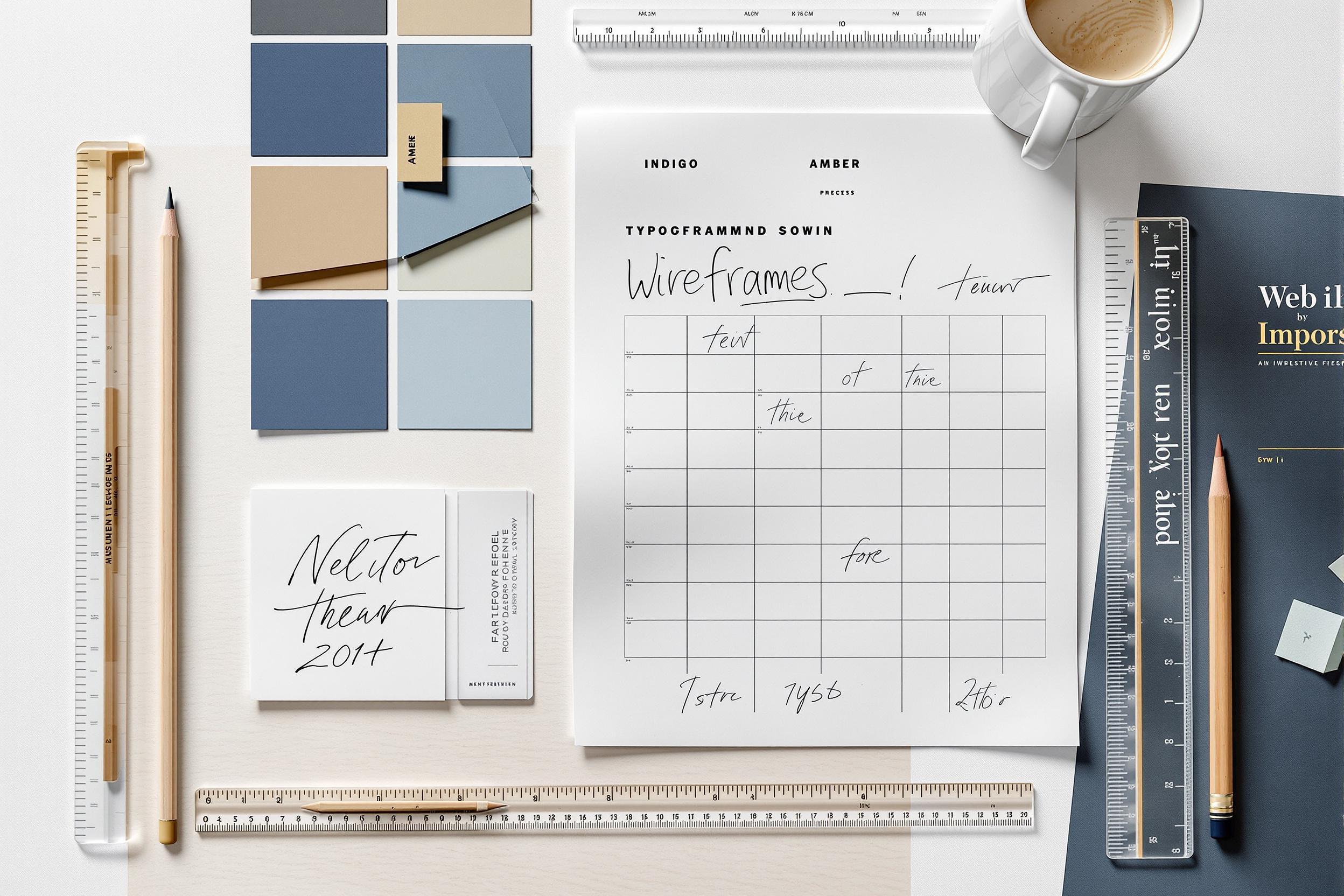
Design systems keep it consistent
As a site grows, consistency becomes the hardest thing to hold. The professional answer is a small design system: a documented set of colours, type scales, spacing units, and reusable components that every page draws from. It need not be elaborate — even a single page of tokens and rules prevents the slow drift into a dozen slightly different buttons and five shades of the same blue. A design system is less about looking impressive and more about making the right decision the easy decision, so quality survives contact with deadlines and multiple hands.